.png)

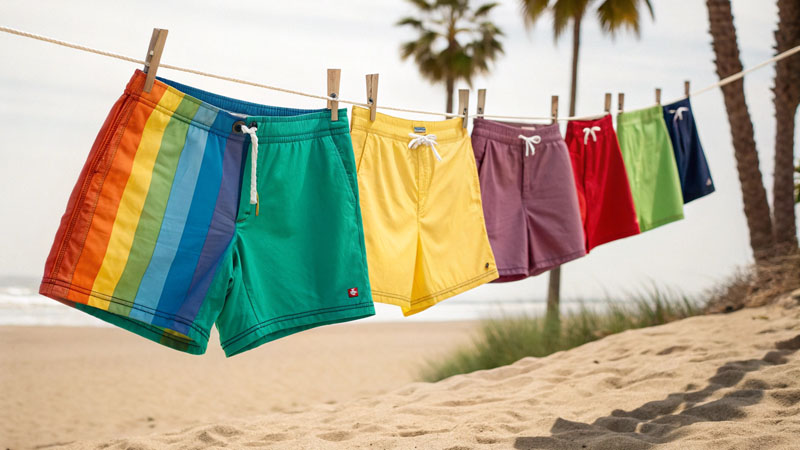
Ever wondered why certain beach shorts practically leap off the rack while others get overlooked? The answer often lies in the emotional and psychological effects of color. How can brands use color psychology to design custom beach shorts that sell and delight?
Color psychology in custom beach shorts involves selecting hues and patterns that trigger specific feelings—like calmness, energy, or excitement—to match a brand’s vibe and target audience. Smart color choices can boost sales, draw attention, and create memorable brand experiences.
Many times, I’ve seen a simple color tweak transform a stalled product into a best-seller. Harnessing the power of color creates a subtle connection between beach shorts and the people who buy them, sparking impulse purchases and repeat business.
Why does color choice matter so much in beach shorts design?
Most beachwear is purchased for leisure and self-expression. Shoppers want shorts that feel just right for their mood or destination.
Color influences instant emotional reactions and buying decisions. The correct shade or pattern can attract a specific customer group, build brand identity, and even signal function or activity level.
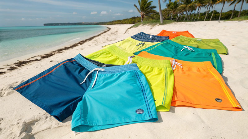
I once worked with a startup targeting family holidays. Our baby blue and pastel coral shorts flew off shelves, while a rival’s bold neons got left behind. We matched seasonal moods, weather, and the target audience’s style. When color matches the purchasing moment, sales rise.
Color’s powerful effects on buying beach shorts:
- Draws attention in crowded retail settings
- Sets or reflects the vibe of the collection (relaxing, dynamic, tropical)
- Supports brand recognition and consistency
- Signals practicality (dark = durability, light = coolness)
| Color Effect | Customer Response | Usage Example |
|---|---|---|
| Vibrant (red/yellow) | Excitement, urgency | Launch, high energy styles |
| Pastel/soft tones | Calm, comfort, trust | Family, resort lines |
| Blue/green shades | Peaceful, cooling | Surf, eco, wellness lines |
| High contrast | Sporty, bold, action | Youth, statement pieces |
Which colors trigger which emotions in beach shorts buyers?
Different colors spark distinct moods and emotional connections, guiding both individual and group purchase behavior.
Bright reds and oranges energize and demand attention, while blues and greens invoke calm and trust. Yellow expresses joy, black and navy signal confidence and style. White and light colors evoke ease and vacation mode.
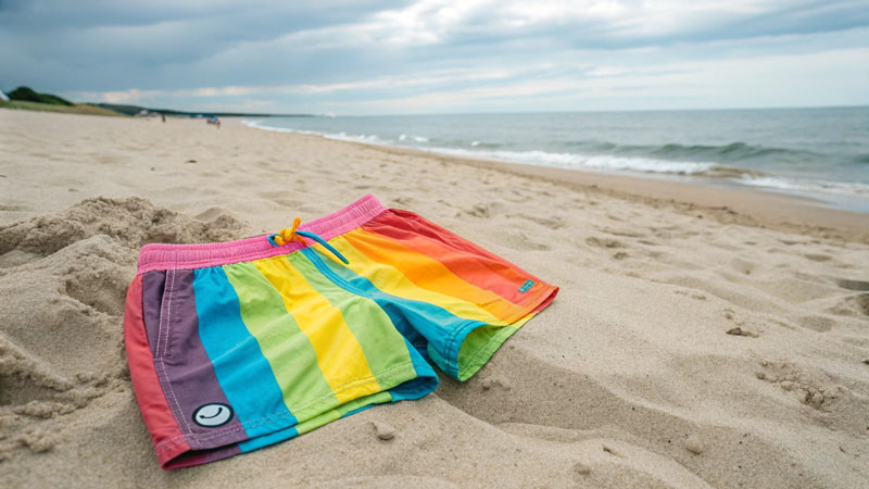
My coastal-inspired lines focus heavily on seafoam, azure blue, and sandy beige—evoking relaxation, trust, and eco-awareness. When shifting to festival or youth collections, I inject yellows, intense reds, or color-blocking for excitement and Instagram appeal. Pairing color emotion with collection goals lets me influence how buyers feel and what they choose.
Common color-emotion pairings:
- Red: energy, confidence, urgency
- Blue: calm, trust, coolness
- Green: balance, freshness, eco
- Yellow: happiness, warmth, optimism
- Black/Navy: sophistication, performance
- White/Beige: simplicity, freedom, sun
| Color | Main Emotion | Good For |
|---|---|---|
| Red | Energetic, bold | Youth, limited editions |
| Blue | Trust, peace, chill | Classic, surf, family |
| Green | Harmony, eco | Wellness, sustainability lines |
| Yellow | Happy, open, fun | Kids/youth, summer launches |
| Black/Navy | Power, clean, pro | Sport, urban, high-end |
| White | Pure, vacation | Luxury, resort, intro offers |
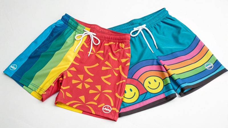
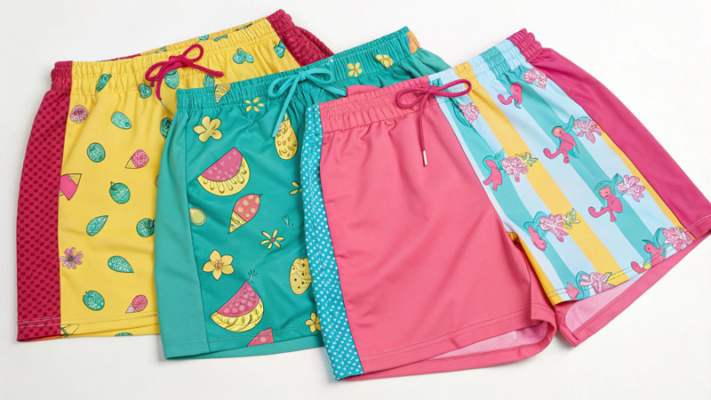
How can brands combine colors and prints to reinforce personality or function?
Color pairings and patterns offer endless ways to highlight brand personality, seasonal trends, or product features.
Brands combine contrasting or complementary colors, use color blocking, or add unique prints to make shorts stand out or express specific vibes. Consistent palettes build recognition, while strategic combos boost perceived value and function.
I often advise new brands to build a base palette tied to their story—like ocean blue and coral for a coast-inspired label. For sport or festival drops, bright color blocking sets an active or celebratory mood, while tonal or muted blends point to comfort and softness.
Introducing prints with local motifs, tropical flora, or geometric elements also delivers unique narrative. For instance, limited runs with indigenous patterns or subtle logos enhance exclusivity and cultural link. Function-focused lines use high visibility or dark performance colorways—like black with yellow piping for lifeguards, or reflective accents for beach runners.
Strategies for color and pattern selection:
- Build a flexible base palette that repeats each drop
- Use complementary or analogous colors for harmonious looks
- Embrace bold blocking or contrast stripes for dynamic energy
- Add branded or story-driven prints to deepen brand identity
| Combo Type | Brand Goal | Example |
|---|---|---|
| Analogous | Calm, coordinated | Blue, teal, seafoam |
| Complementary | Vibrance, excitement | Coral and aqua, yellow and navy |
| Color blocking | Sport, youthful, bold | Black/white/neon stripes |
| Branded prints | Unique, cultural, story | Local motifs, illustrated elements |
How can color psychology support sustainability and inclusivity in beach shorts?
Color choices influence not just emotion but also the perception of sustainability and inclusiveness in fashion.
Eco brands lean on nature-inspired colors or undyed fabrics, signaling earth-friendliness. Inclusive sizing and gender-neutral palettes use universal hues—like navy, forest green, or soft pastels—welcoming more shoppers.
I shifted to natural, soft greens and browns in our recycled lines—these palettes cue shoppers toward eco values, difference to mass-market neon. For inclusive drops, we avoid traditionally gendered color codes, instead offering sunset tones, blues, and off-whites in all sizes and fits. This approach not only aligns with values but also expands our audience and retail points.
Color as a sign of values:
- Natural/undyed: eco, minimalist, honest
- Earthy tones: organic, grounded brand story
- Universal hues: gender-neutral, inclusive, accessible
- Limited printing: lower impact, green messaging
| Color Approach | Value Signaled | Target Audience |
|---|---|---|
| Earth tones | Green, wellness | Eco/shoppers, wellness buyers |
| Universal palette | Inclusion, openness | All genders, broad range |
| Minimal colors | Less impact, honest | Minimalist, sustainable lines |
| Seasonal palette | Relevance, freshness | Trend followers, style seekers |
Conclusion
Color psychology gives custom beach shorts brands an edge—to craft standout collections, attract the right customers, and tell their story at a glance. By pairing emotional hues, prints, seasonal needs, and audience values, brands drive sales and deepen loyalty, one well-chosen color at a time.
Professional Insights from Airswimwear
- Palette Planning: Every custom batch starts with a clear, limited palette that ties to brand identity, season, or emotion. This streamlines production and ensures eye-catching retail impact.
- Function Meets Feeling: Design with both use-case and emotional appeal—bolds for sports, softs for comfort collections, and blues/greens for calm, eco-friendly lines.
- Inclusivity by Color: Broaden your reach by offering universal, gender-neutral tones in core styles; use color to welcome all sizes and backgrounds, not just trend-driven buyers.
- Prints with Purpose: Collaborate on meaningful prints—local, cultural, or story-driven—to add depth, exclusivity, and customer connection beyond just hue selection.
FAQs: Using Color Psychology in Custom Beach Shorts
1. Which colors sell best for men’s versus women’s beach shorts?
Men’s lines favor blues, greens, and neutrals; women’s styles trend toward corals, pastels, and playful prints, but these lines are blurring.
2. How do I know which colors fit my brand story?
Research your audience’s lifestyle, build mood boards, and test with small drops for instant feedback.
3. Can color improve shorts’ perceived durability?
Darker colors and crisp contrasts signal performance and lasting value—ideal for active or outdoor drops.
4. What’s the best approach for an eco-friendly shorts line?
Go for earth-inspired or undyed fabrics and highlight those choices in your marketing to show authenticity.
5. How many colors should my collection include?
Three to six main colors, with one or two accent hues, keeps offerings manageable yet diverse.
6. Can color psychology help seasonal launches?
Absolutely—align hues to weather, holidays, or local trends for instant buzz and higher conversion.


-1024x337.png)