.png)

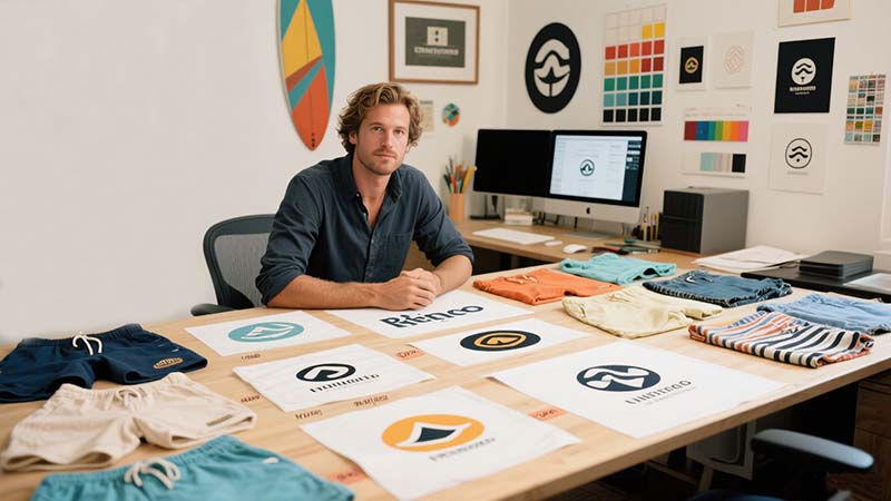
Ever stared at a pair of board shorts and thought, “Dang, that logo just works”? Well, that’s no accident. Good logo design isn’t just a detail—it’s the soul of your surfwear brand.
Want your board shorts logo to turn heads at the beach?
Start by understanding that surfwear isn’t just fashion—it’s a lifestyle. A strong logo connects with that culture, tells a story, and pops off the fabric with personality. Keep it simple, adaptable, and aligned with your target vibe. Whether bold and edgy or chill and retro, make sure it feels right to your crowd.
Logos on board shorts aren’t just decoration—they’re silent brand ambassadors riding waves with your customers.
Why Logo Design Matters for Board Shorts Branding
When it comes to board shorts, your logo often says more than your whole product page.
Your logo isn’t just a graphic—it’s your first impression.
In surfwear, people want to wear a vibe. A solid logo reflects your brand’s spirit—whether that’s freedom, adrenaline, or just laid-back beach days. It builds instant recognition and loyalty, especially if your target customer spots it on someone else in the water and thinks, “I want that.”
Building Trust Through Consistency
Consistency matters. If your logo design looks pro, your whole brand feels legit. A sloppy logo? People might assume the same about your stitching.
Understanding Surfwear Culture and Aesthetic
Surfwear isn’t just about function—it’s about feeling something.
Design with the surf lifestyle in mind.
Board shorts live in a world of waves, sun, salt, and soul. Your logo should echo that. Whether it’s vintage Hawaiian, minimalist modern, or graffiti-inspired, surfwear design has its own rules—rooted in freedom, rebellion, and nature. You need to speak that language visually.
Tapping Into the Culture
Talk to real surfers. Scroll through surf mags. Hang out at local breaks. That’s where the inspiration for your logo lives.
Key Elements of a Great Board Shorts Logo
A cool logo might make someone glance. A great logo makes them remember.
A killer board shorts logo is simple, scalable, and meaningful.
It should be easy to spot from a distance (say, on a wave) and still look clean when printed small. Avoid too much detail—it’ll get lost. Use shapes, symbols, or icons that tie back to the ocean, boards, or movement.
Essentials Checklist
| Element | Why It Matters |
|---|---|
| Simplicity | Clean lines = better printing |
| Symbolism | Connects emotionally with your niche |
| Flexibility | Works on shorts, tees, stickers |
| Timelessness | Avoids trends that fade too fast |
Placement Matters: Where to Print Your Logo on Board Shorts
A great logo in the wrong spot? Big missed opportunity.
Placement affects visibility, style, and customer perception.
The most common spots? Bottom leg hem, back pocket, waistband tag, or side panel. But each has its own vibe. Side panel prints feel bolder. Waistband tags are more subtle and premium-feeling. You want a location that balances impact with your brand’s aesthetic.
Strategic Placement Tips
- Front hem: Best for subtle branding.
- Side panel: Ideal for bold logos.
- Back pocket: Classic and practical.
- All-over print: Edgy, if your logo is minimalist enough.
Choosing Colors and Fonts That Match Surfwear Vibes
Colors and fonts can make or break the feel of your logo.
Think beach tones, bold contrasts, or retro palettes.
Bright neons scream ‘80s surf punk, while earthy tones speak to eco-conscious surfers. Fonts matter too—blocky for toughness, script for fluidity. Choose what matches your brand's energy, not just what’s trendy.
Font & Color Pairing Guide
| Style Vibe | Font Type | Color Suggestions |
|---|---|---|
| Classic Surf | Retro Sans Serif | Navy, Orange, Cream |
| Eco-Friendly | Clean Minimalist | Sand, Olive, Sky Blue |
| Street Surf | Graffiti / Handdrawn | Black, Red, Bright Aqua |
Material & Print Considerations: What Works Best for Board Shorts
Logos don’t just look good—they need to last.
Match your printing method to your board short fabric.
Sublimation works wonders on polyester, delivering crisp, fade-resistant logos. Embroidery adds premium texture but only suits thicker panels. Screen printing is versatile but can crack over time if not done right. Always test your logo on actual samples before mass production.
Print Methods Breakdown
| Print Method | Pros | Cons |
|---|---|---|
| Sublimation | Durable, vibrant | Only for light-colored poly |
| Embroidery | Premium feel, durable | Limited placement flexibility |
| Screen Printing | Cost-effective, bold | May fade or crack over time |
How to Design a Logo that Stands Out in a Crowded Market
There are lots of surf brands. So how do you stand out?
Your logo should tell your story, not someone else’s.
Don’t copy the big names—learn from them. Are you the eco-warrior brand? The street-meets-surf crew? Your logo should reflect your why. That authenticity? It’s magnetic. People can feel it.
3 Tips to Stay Original
- Use your journey as inspiration.
- Combine unexpected elements (e.g., nature + graffiti).
- Avoid cliché wave icons—get creative.
Real-Life Examples: Successful Board Shorts Logo Designs
Let’s break down a few logos that just work.
Think Vissla, Quiksilver, RVCA, Outerknown.
Each logo is simple, memorable, and true to its brand. Vissla’s abstract icon speaks to creativity. RVCA’s block letters are bold and clean. Outerknown goes subtle and conscious—matching its sustainability mission.
What They Got Right
- Clarity
- Consistency across products
- Strong storytelling
Use these as reference—not templates.
Common Mistakes to Avoid in Surfwear Logo Design
I’ve seen awesome shorts ruined by bad logos.
The most common mistake? Overcomplicating it.
Details get lost in print. Gradients often don’t work. And choosing trendy fonts? You’ll regret it in two seasons. Another big one: placing the logo somewhere it gets worn out fast or feels awkward when worn.
Logo Fails to Watch For
- Tiny unreadable text
- Low-contrast colors
- Printing on stretchy zones (warping!)
- Trying too hard to be "cool" instead of clear
Final Tips from a Surfwear Industry Expert
I’ve worked with dozens of surfwear startups—and here’s my golden rule:
Design for the lifestyle, not just the look.
Your logo should be like a surfer’s tattoo: meaningful, stylish, and something they’d proudly wear. Keep it bold, authentic, and always test it on real fabric before going big.
Conclusion
A great logo doesn’t just sit on board shorts—it surfs with your story. Keep it simple, soulful, and true to your brand’s wave.


-1024x337.png)